Color Reduction in Photoshop: A Guide for Surface Pattern Designers
Managing color complexity is crucial for surface pattern designers, especially those who combine traditional painting techniques with digital tools to create captivating patterns. Bringing a hand-painted feel to surface pattern designs can be tricky when you are limited by the number of colors in your design. Fortunately, Photoshop provides a comprehensive toolkit for simplifying and perfecting color selections. Among its powerful tools is the Index Color feature, which reduces color counts in your images while preserving visual quality and preparing them for diverse print and digital uses.
Practical Reasons for Limiting Colors in Your Design
As a surface pattern designer, you might need to reduce the number of colors in your design for various reasons:
Printing Constraints: Many printing methods, like screen printing, have limits on colors. Fewer colors ensure designs can be printed accurately and affordably.
Cost Efficiency: Using fewer colors lowers production costs, making products more affordable for consumers.
File Size and Performance: Designs with fewer colors have smaller file sizes, which load faster online and use less device storage.
Consistency: Simplifying colors helps maintain design consistency across different products and applications.
Aesthetic Appeal: Limiting colors can enhance design cohesion and visual appeal.
Production Flexibility: Designs with fewer colors are easier to customize and adapt to different products and market demands.
Prepare Your Image
Before reducing colors, ensure your image is in perfect shape both visually and technically. Color reduction should be the final step in your design process. Ensure you have adjusted brightness, contrast, and levels, enhanced color vibrancy, cleaned your design, and arranged your motifs into a flawless repeat tile. Confirm that the image size and DPI are sufficient for your project (e.g., 3000 x 3000 pixels at 150 DPI) and that your image is in RGB mode.
Image size and resolution.
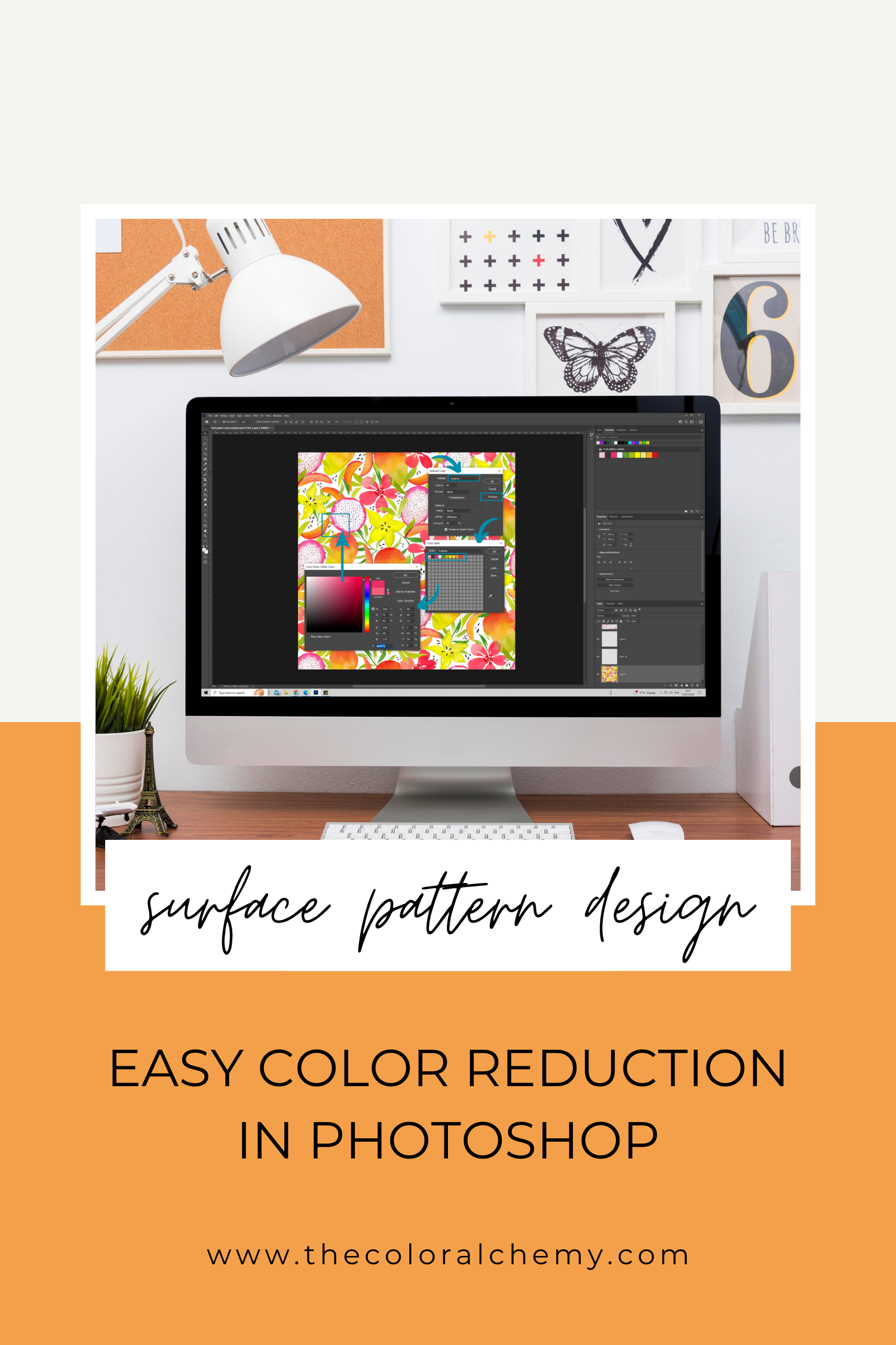
Reducing Colors Using Index Color in Adobe Photoshop
When converting an image to Index Color mode in Photoshop, you have multiple options, each influencing how the colors are reduced and managed. While you can experiment with these settings endlessly, our focus will be on preserving the hand-painted feel of traditional art media, ensuring smooth transitions, and maintaining an organic look.
Here are five simple steps to help you achieve the best results:
1) Indexed Color Conversion
Go to Image > Mode > Indexed Color.
2) Palette Options
Choose Local (Adaptive) palette. This option creates a palette based on the colors most present in the image, ideal for traditional hand-painted designs.
3) Set the number of colors
Adjust the Colors slider to select the number of colors. Start with 256 and gradually decrease to balance color fidelity and simplicity. Or directly insert the required number of colours you want to work with.
4) Fine-Tune Additional Options
Forced Colors: Include essential colors like Black and White or Primaries if they are critical to your design.
Transparency: Check the Transparency box if your design includes transparent areas.
Matte: Choose a matte color to blend transparent areas with a specific background color.
Dithering: Select Diffusion to apply a random pattern that helps simulate missing colors, reduce banding, and maintain a smooth appearance.
Indexed color conversion configuration.
5) Choose your preferred colors for your design
Use a custom palette to pick specific colors. Ensure the preview is not selected, open a color table, and use the eyedropper tool to select desired shades from your initial design.
Choosing color range from original design with eyedropper tool.
💡 Tips for the Best Results
High-Quality Scan: Start with the highest-quality scan or digital file to ensure the best outcome.
Adjust: Experiment with different palettes and dithering options to achieve the best results.
Custom Palettes: Save your color palettes to maintain color consistency and keep your files easily adjustable.
Always save your custom color palette.
Bonus: Color Separation
Color separation is essential for printing methods like screen printing. It involves isolating each color in a design onto its own layer, ensuring accurate reproduction and vibrant prints.
1) Open Your Design and Custom Color Palette
Ensure your design is open in Photoshop, along with the custom color palette you have created.
2) Use Color Range Feature
Navigate to Select > Color Range. This function helps create selections and masks based on the color of the pixels.
3) Set up Color Range Function
Select Sample Colors from the dropdown menu.
Adjust the Fuzziness slider to zero. This ensures that only the exact color selected with the eyedropper tool is chosen.
4) Pick a Color
With the eyedropper tool, click on the first color from your custom color palette you want to separate.
Using Color Range Feature.
5) Create a New Layer
With the color selection active, create a new layer. This new layer will contain only the selected color.
Name the layer according to the color it represents for easy identification.
6) Repeat for Each Color
Repeat the above steps for each color in your design. Each color should be isolated onto its own layer.
Creating a new layer with color selection.
💡 Tips for Optimizing Your Workflow
Save Frequently: Make sure to save your work frequently to avoid losing any progress.
Layer Organization: Keep your layers organized by naming them appropriately and grouping them if necessary.
Use Layer Masks: Utilize layer masks to refine your color separations further. This can help make precise adjustments without altering the original design.
Preview Your Design: Regularly preview your design by switching the visibility of layers to ensure that the separations are accurate.
Photoshop's Index Color feature helps surface pattern designers simplify their designs without losing visual quality. This tool is essential for meeting printing requirements, reducing costs, and improving file performance. By carefully preparing your design and selecting the correct settings, you can maintain the desired hand-painted look while making your designs versatile for different products. With high-quality scans and thoughtful palette choices, you can effectively manage color reduction, ensuring your patterns look great in both digital and print formats.
Moreover, mastering color separation can significantly enhance your design process, particularly for print applications. By isolating each color onto separate layers, you ensure your designs are print-ready and maintain their intended visual appeal.
Pin this article for later ✔
NAVIGATE BY CATEGORY
AUTHOR
HI THERE, I'M PETRA! :)

Independent Surface Pattern Designer, Watercolor Enthusiast and Pattern Lover. The creative force behind THE COLOR ALCHEMY🌈🎨🙋🏻♀️